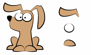
Jon gave me a good idea in using varied line widths to make my drawings more effective.
In order to find which one works for me I will try a new type every drawing.
He gave me These as examples:
I also found a simplified version online:
http://www.how-to-draw-funny-cartoons.com/outline-examples.html
Subscribe to:
Post Comments (Atom)


I think your image is a lot more fitting; I was in a hurry and couldn't seem to find anything that would put my point across. I hope it makes sense?
ReplyDeleteYes it certainly makes sense, you explained it very well so I know what direction I should venture into and what I should be trying.
ReplyDeleteThanks Jon, this will help me take not only these drawings but the others to a different level :D
Good suggestion from Jon there. Its a simple and effective way of adding volume to a drawing. I think the first dog example has some mistakes though- I would avoid having the line disappear completely, and make sure that all the lines are consistent (ie the thickest lines is always opposite to the imagined light source).
ReplyDeleteIf you are designing a more iconic character, a uniform line is more appropriate of course.
Ok, I understand.
ReplyDeleteI'll make use of thick lines in shadow and light lines thinner technique, I think I tried to do that on the nude Nikulas Gray, but I will also use that on the clothes outline too~